Game-Styled Learning Sites
Two Roblox- and Fortnite-styled sites that walk a nervous eleven-year-old into a new school
- Sites
- 2, single-file
- Style
- Fortnite Battle Pass · Roblox comic
- Island
- 7 mini-games, 20 tiers
- Rivals
- 8 comic panels, obby, shop
- Built for
- iPhone, offline, no install
- Size
- 89 KB and 59 KB
What this case study claims
Design decisions, intended behaviour and the reasoning behind them, plus counts verified against the built product. It does not claim learner outcomes, adoption or improvement: those have not been measured, and describing an intention as a result would be the easiest thing on this page to get wrong.
Overview
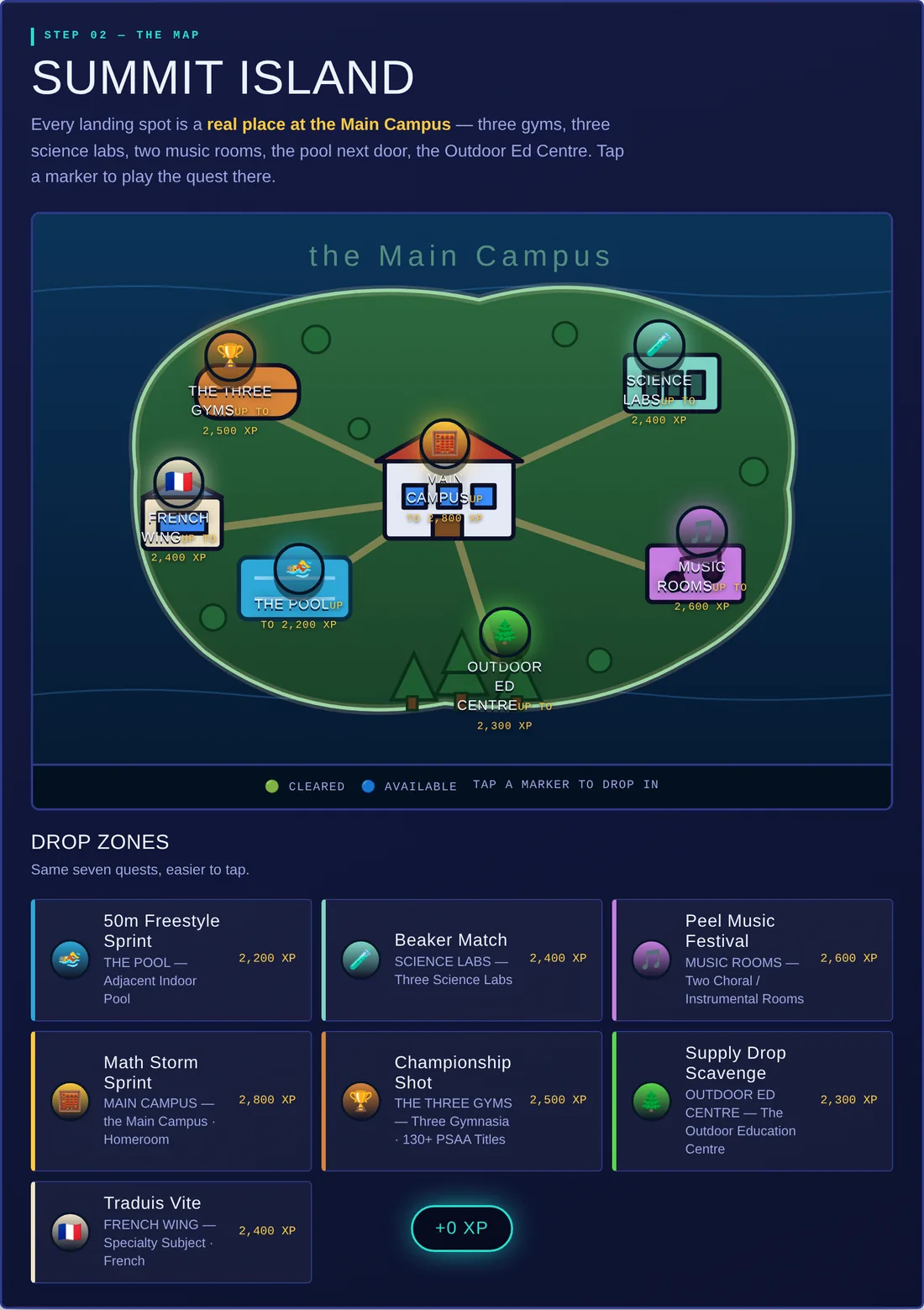
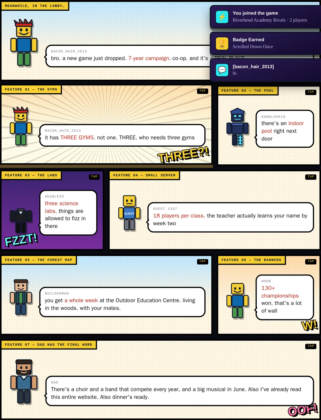
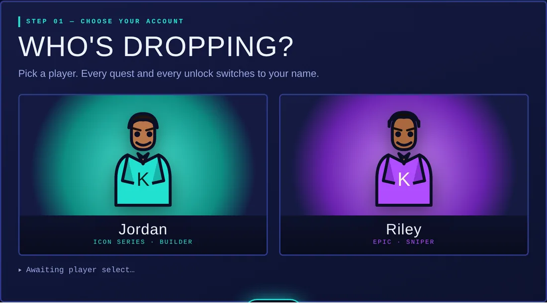
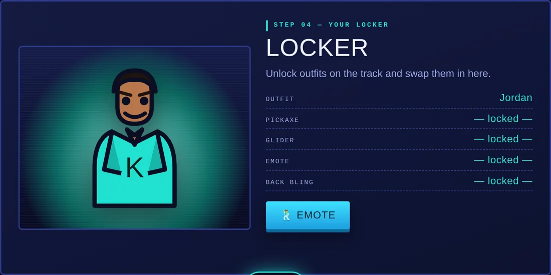
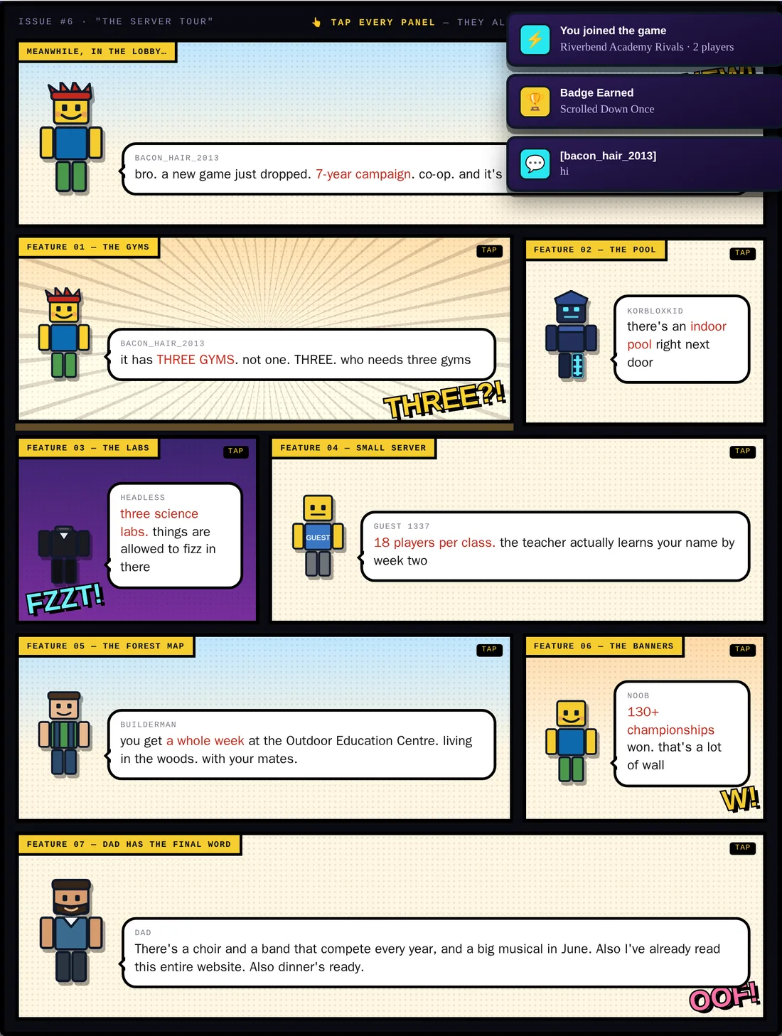
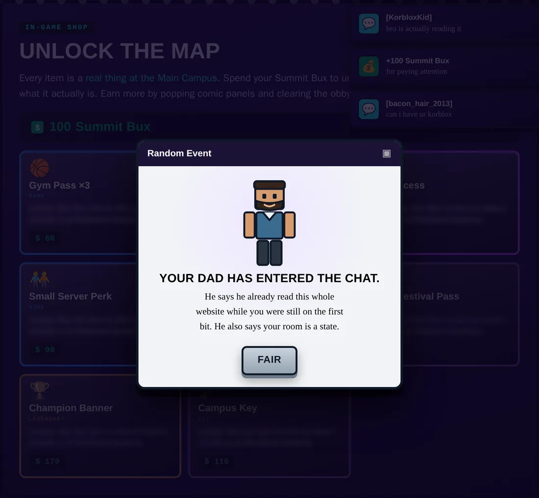
Two single-file sites for children about to start at a new school. One is a Fortnite-styled Battle Pass — seven playable mini-games, an experience and tier system, a twenty-tier reward track. The other is a Roblox-styled interactive comic — eight tappable panels, an obby mini-game, and a shop where the currency buys real facts about the school rather than cosmetics. Both run from a single HTML file with no install, no account and no network, because the reader is a child holding a phone. Every graphic is drawn in code: the bus, the parachute, the blocky avatars, the comic panels. There are no image files in either build.
Problem
A child moving school is handed a prospectus written for their parents. It answers the parents’ questions — curriculum, outcomes, fees — and none of the child’s, which are smaller and more urgent: will I know anyone, is there anything here I am good at, what happens on the first morning. The information a child needs is usually present in the school’s own material and buried in a register they cannot read.
Audience
Children of about eleven, on a phone, who play these games daily and read their visual language fluently — and who will close anything that looks like homework within about four seconds.
My role
- Concept and structure for both builds
- Interaction design — the tier system, the quest model, the shop economy, the mini-games
- Illustration in code — every avatar, panel and object drawn as vector markup rather than sourced
- Writing — the panel dialogue, the quest copy and the in-game voice
- Front-end build — two self-contained files, offline, phone-first
Goals
What the design set out to achieve. These are objectives, not results.
- Use the visual grammar children already read rather than the one adults find appropriate
- Make the reward for progressing be real information, not points
- Get the child to do something in the real world, not only on the screen
- Run on a phone with no install, no account and no signal
- Hold attention for long enough that the school stops being abstract
How it works
One HTML file each: markup, styling, illustration and logic in a single document, no framework and no build step. Graphics are inline vector, so the pages weigh 89 KB and 59 KB in total and load instantly on a phone with a weak connection. State lives in local storage, so a child can close the tab mid-quest and come back to their tier and their unlocks intact. Nothing is sent anywhere and there is nothing to sign into.
Design decisions
The loot is real information
In the shop, the currency does not buy cosmetics. It buys facts about the school — how many science labs, how big a class is, what happens in June. The game economy is a delivery mechanism for the prospectus a child would never read.
Quests you cannot play on a screen
The strongest mechanic in either build. A set of quests worth real experience points that can only be completed in life: learn three classmates’ names on day one, join one thing, put your hand up and ask a question, help someone who is stuck. It uses a game structure to rehearse the social behaviours that actually determine whether a child settles.
Drawn in code, not sourced
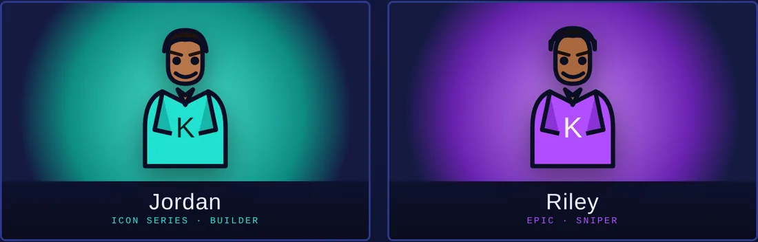
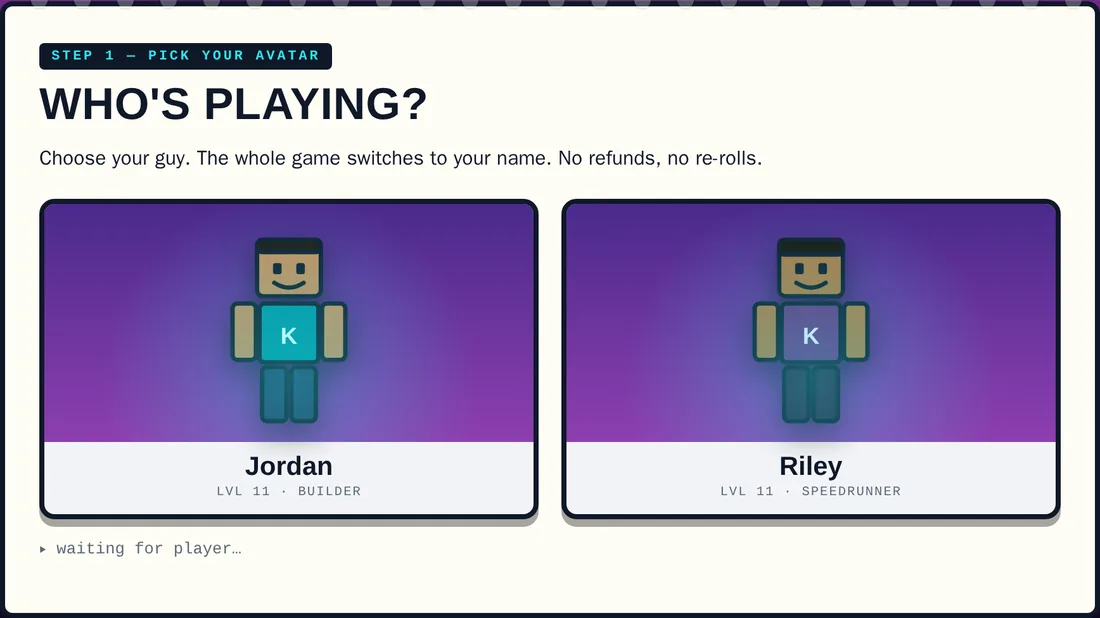
Every avatar and panel is vector markup written by hand. It keeps both files tiny, it means nothing is licensed from anywhere, and it makes the style consistent in a way that assembled stock art never is.
Phone first, and offline
The reader is a child on an iPhone, possibly in a car. No install, no account, no network calls — it opens from a link and it works.
Four seconds to prove itself
Both open on motion and colour rather than a paragraph. A child who suspects they are being taught something closes the tab, so the first screen has to read as a game before it reads as school.
AI’s role
Drafting the vector illustration and the repetitive interface scaffolding — tier rows, panel frames, mini-game shells — so the time went into the structure and the writing rather than into hand-coding forty near-identical blocks.
Human judgment
Everything that makes it land. Which facts about a school a child actually cares about, as opposed to the ones the school leads with. Whether a joke is funny to an eleven-year-old or only to an adult imagining one. Which real-life behaviours are worth turning into quests. And the line these must not cross: the moment a game like this starts assessing a child rather than welcoming them, it becomes the thing it was built to avoid.
Experience
Shown from the outside only
This unit is a paid product, and the teaching material is the product. What follows shows its front door and describes its architecture in words. No lesson pages, printables, assessments or games are reproduced, and no screenshot here contains text a reader could re-type and use.
Challenges
Tone. The failure mode is an adult writing what they imagine a child sounds like, which children detect immediately. The dialogue went through several passes to sound like the chat these games actually contain rather than a teacher’s impression of it.
Iteration
The in-real-life quests were added late and changed what the project was. Before them it was a well-made brochure in a game costume. After them it did something no brochure can — it asked the child to act, and gave them credit for it.
Reflection
These were built for two specific children rather than as products, which is why they are shown here and not sold. They also answer a question the rest of this portfolio does not: whether the same care that goes into a curriculum unit can be applied to the visual language children choose for themselves. The names, the school and the location have been changed in every image on this page.
Skills demonstrated
- Interaction design for children
- Game mechanics applied to non-game goals
- Vector illustration in code
- Offline-first, single-file front-end build
- Writing in a child’s register
- Transition and belonging as a design problem